Sunday 27 February 2011

Winchester 26th & 27th Feb.

Portsmouth Old Town.

Clock tower on end of terrace shop.

These are old braskwaters on the sea front at Portsmouth.


One of the breakwater timbers (from above) had a hold in it. This shot was taken through the hole.
My aim was to get the seaweed and shingle in focus.


The breakwater, showing the old timbers, weathered and worn, with the old metal pins and nails still showing. The growth on the side gives the timber some colour.

First Assignment sent off

I have managed to compress the photos down and sent them off to my tutor on three separate e-mails. Now to start the second section.

Thursday 24 February 2011

Some of the Assignment photos that did and didn't make it.

These are a few more photo's that were included/excluded for the first assignment.

This was used as an example of both straights and curves.
It is the head of my 12 string guitar. I like the curves of the string on the tuner, the tuners and the lettering.


This was taken in January at RHS Rosemoor. I love the texture.


This wasn't included. It was ro try and get straights and curves on a single photo.
I couldn't get enough depth of field to keep the strings in focus at this range.

This was taken for the Low option of High/Low.
It was taken from sand level, but I decided not to use it.


This is Aprilla. It was not for the assignment. It was taken so I can send it to Jenny, my daughter.
I just love the clarity of the photo and the expression.

Assignment 1 - 49meg and counting. Hmmm. Have to post it.

I have been working on my first assignment for the OCA photography course. I have to submit 16 photos, 8 pairs, showing different contrasts. Rough/smooth, still/moving, etc. It was quite a challenging assignment and I had to look through some archive pictures to get sufficient quantity/quality. Here are a few of the ones I selected. It has been a challenging assignment, getting pictures that I am happy with, both in terms of the composition and the quality. I have used some photos that were taken as part of the exercises leading up to thsi assignment as well as some digital photographs from 2010. I have also included one form my 35mm film days as it is a shot that I just couldn't recreate easily as I didn't have the subject matter.

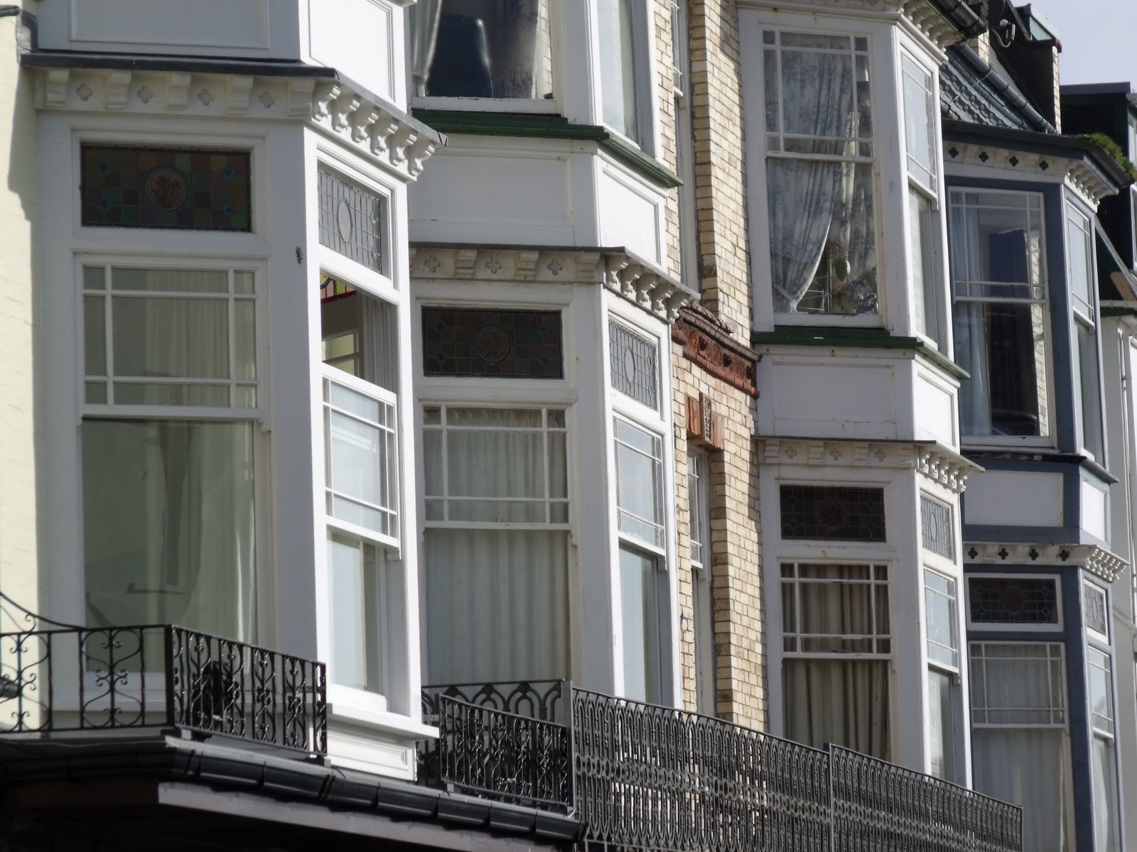
Straight and Curved: This photo is for straight (lines).
I was trying to think of a good example of straight lines, and while looking around the room saw this.


Soft and Hard: I saw this image the other morning.
I love the was the ivy appears to be tickling the chin of the cat. The expression is perfect.
The weathering gives the stone a lovely texture.

Liquid and Solid: The sea at Ilfracombe harbour, this morning.
A bit obvious fofr liquid. But I just love sea pictures.

Still and Moving: This is from some time ago (from 35mm) but I love the image.
It also uses a technique encountered in the examples of bluring the subject (slow shutter speed).


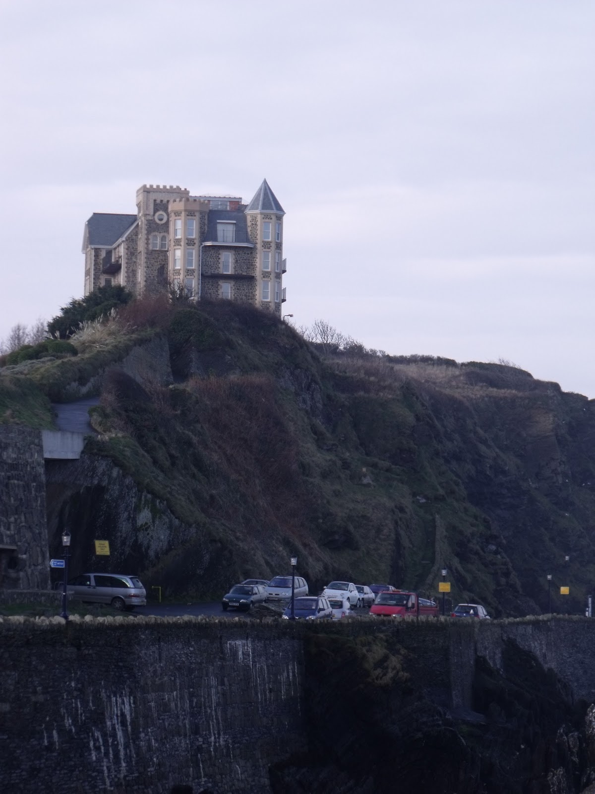
Rough and Smooth: This is part of a wall on the Torrs.
I used the exercise technique of focussing on a mid-way point and using a low f-stop.
This only makes the mid-way point in focus, drawing your eye to the ragged slate. 


Soft and Hard: This is soft in so many ways. But is really to show the fur.
He is also the softest cat in the world too. It is lovely to see the individual hairs on his face and leg.

So far I have really enjoyed this course. While having a good working knowledge of 35mm cameras I am finding the whole world of digital really inspiring and it has given me a new lease of life for taking photographs. The ability to see, instantly, if the shot has come out as you expected, is fantastic. Getting used to the new camera is quite a challenge, as while it has all the features I am used to on a 35mm camera, naviagting the menus and remembering all the options is a but tricky, especially as the manual is 160 pages (too much to carry around with you). I am still using the compact digital camera for quick shots, when I don't have my main camera with me.

When I belonged to a camera club I found I ended up just taking photos for judges, making the whole process mechanical and expensive. Working through these exercises have made me re-examine the way I choose a subjuct and frame it. I am looking forward to the next set of exercises.

Thursday 17 February 2011

Cropping

After taking a basic shot of Ilfracombe harbour (below) and quay, I used the cameras Panorama feature to stitch together three photos. I used the basic shot first and tried cropping this with digital software. While this worked fine, finding a different location to get a clear view of the houses around the harbour and using the cameras features decided on the panorama option. This does give you the benefit of a letterbox photo, but with the minimum of trimming (top/bottom).


Ilfracombe Harbour and Quay, including the church/lighthouse.


This is a similar shot that just shows the houses on the quay.

Vertical and Horizontal Frames (2)

This is the second page of the Portrait/Landscape comparissons.


The landscape photo shows the church/lighthouse on the top of the hill. The portrait one gives more depth to the shot as it includes the quayside. It does, however, loose the flagpole and flag, which does add to the landscape picture.

This is a closer view of the church/lighthouse in the photos above. There is not a lot of difference between these pictures. I feel that the portrait shot makes the building look as if it is on top of a hill, because of the added sky. It feels like you are really looking up a hill.


Both pictures have their positives. The portrait one give emphasis to the vertical lines, where as the landscape picture gives more to the zig-zag lines made from the layered slate.


I prefer the portrait shot as it really leads you into the frame from the bottom. Drawing you to the change in colour/type of rope, before it swirls round on itself. Because the grey rope touches both sides of the frame it doesn't appear take you eye out of the picture. The landscape picture does draw you into the frame, but as you follow the rope your eye disappears out of the frame at the top left.


This seagull just wanted to have it's picture taken. Both appear to work ok. I prefer the landscape shot and would probably crop the shot, taking out the white bulb (to the right). Cropping the top of the portrait picture as well, will preserve the shape of the frame.


Vertical and Horizontal Frames (1)

These photo's show the same image in landscape and portrait.

Both of these images work well. In landscape it gives a vastness to the beach and rocks, while in portrait gives depth to the beach and allows the eye to be drawn into the photo from the bottom up.


These images are very similar. In landscape you get the cliff edge and it feels that the building is on the top of a high point, and vulnerable. In portrait you loose the cliff edge and so it could be just one of several buildings (the others of which are out of site).


Both these pictures work. The portrait picture picks out the centre building of the landscape one. Cropping the portrait shot to just show the brick building would make the focus on it stronger.


Both of these pictures work. I prefer the landscape shot as you get more of the iron railings, and can also see more of the horizontal lines in the wall.


Because of the perspective in this shot I feel that the landscape gives a great deal of depth that is lost on the portrait one. The portrait shot give height to the building. In both shots the horizontal and vertical lines do a good job of creating interest to the subject matter.


Positioning the Horizon

These pairs of photo's are duplicates of the same scene, but with the horizon in different places.


The first two are looking west from Ilfracombe harbour. The first shows the horizon across the top third of the frame. It appears to me to be a balanced photograph even though the subject matter is not truely inspiring and the contrast is not perfect.


The horizon is placed  in the second shot is in the middle of the frame. This splits the photograph. There is more colour saturation in this one, but this is probably from the auto exposure, which is locked to the centre of the frame, and is picking up a mid-way balace of light.


The second two are from the same vantage point, but are in landscape. This makes the horizon more promonant. This picture places the horizon a third of the way down the frame.


This photo puts the horizon towards the bottom third of the frame, a lot lower than the second picture in the first pair. Both pictures appear well balanced. I personally prefer the first one, although I feel that both of them work. The mark near the centre of the picture is a passing seagull. While this would not normally bother my, it does appear to draw your eye away from everything else on the image.


The third pair of pictures, are in portrait and of the sandy beach at Ilfracombe. I took advantage of a subject in a red coat in the centre of the frame to break up the grey colour. The horizon is at the extreme top of the frame. It gives a great depth to the frame. The rocks in the foreground lead the eye to the person in the Red coat and then to the rocks and the sea.


The second picture of this pair shows the horizon at the bottom third of the frame. I feel that this gives too much sea/sky. It does give the impression that there is no land beyond the horizon.

Dividing the Frame

While this was not an exercise, I liked the photos in the chapter and while taking pictures for other exercises I took these. They all break up the frame in different ways.

There are horizontal lines from the slate wall and vertical iron railings, in the foreground.
Because the slate is laid in the layers we also get 90degree (approx.) angles too.


These are pure horizontal lines. This is an RNLI wooden slipway.


This rusted gate adds scrolls (curves) to the vertical and horizontal lines.
The horizontal lines are added to by the brick wall in the background.


The balance between the four openings in the cross mullion
are emphasised with the arched brickwork above.

Focal Length and different viewpoints

In this picture of a Devon slate wall, I took two images from the same position. This was zoomed in to just show a small section of the wall. The pattern adds to the vertical lines. This picture is flat, and taken at a right angle to the subject. It is only the leaves that give it any colour.

These fisherman floats and nets give a diagonal (top left to bottom right) and the colours are in contrast to the slate wall photo above. The diagonal cutting the across the picture separates the white and green netting.


The mooring rope leads you into the photo from the bottom right, snaking up to the top of the photo. The change from one type of rope from another, and the change in colour, adds interest to the subject. Using a high F-stop and wide angle lens allowed the whole rope to remain in focus. This could have been taken with a smaller F-stop and from further back with a zoom lens and thrown part of the rope out of focus, but I feel that this works better.


This photo was used originally for the depot of field photos. It was taken with a wide angle and high F-stop, which puts the bush and cliffs in focus.